

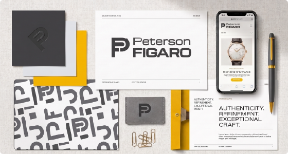
Peterson Figaro
PETERSON FIGARO is a comprehensive brand identity project developed to establish a bold, modern, and professional visual presence for a Graphic Designer. The project focused on creating a distinctive logo, visual identity system, brand guidelines, and marketing assets that communicate creativity, innovation, and trust. The result is a cohesive brand experience that strengthens recognition, builds credibility, and positions the agency for long-term growth. 01_Discovery The discovery phase focused on understanding PETERSON FIGARO’s brand vision, goals, and positioning within the creative industry. The objective was to define a visual identity that reflects its expertise in branding, UX/UI design, website design, and visual content creation while creating a strong and memorable presence. I identified the key elements needed to build a brand that communicates creativity, professionalism, innovation, and trust. This foundation guided the development of a cohesive identity system designed to connect with businesses and showcase PET FIG as a versatile creative partner. 02_Research & Strategy The research and strategy phase focused on defining PETERSON FIGARO’s market position, visual direction, and brand personality. I analyzed creative industry trends, competitor identities, and audience expectations to develop a strategy that would differentiate the brand while maintaining a professional and modern presence. The strategy was built around creating a flexible identity system that could adapt across digital platforms, marketing materials, and creative projects while consistently communicating creativity, innovation, and trust. 03_Concept Development The concept development phase focused on translating the research and strategy into a visual direction for PETERON FIGARO. I explored different logo concepts, symbols, typography styles, and visual elements to create an identity that represents creativity, professionalism, and a strong personal brand presence. Through sketching and experimentation, I refined the ideas into a clear visual concept that balances simplicity, memorability, and versatility across digital and print applications. My Thinking The interconnected “P” and “F” symbolize the integration of multiple creative disciplines into a single identity. The monogram reflects a comprehensive creative practice, uniting branding, UX/UI design, web design, photography, and videography within one cohesive visual system. Why These Concepts Were Discarded Each concept was evaluated based on its ability to accurately represent the brand’s identity and positioning. Concept B: Conveyed an architectural aesthetic that did not align with the brand’s creative focus. Concept C: Resembled the visual language commonly associated with fashion brands. Concept D: Presented a style that felt more appropriate for the fashion industry than a multidisciplinary creative brand. Concept F: Communicated a technology-focused identity that suggested an IT company rather than a creative studio. Color Palette The color palette was carefully selected to balance creativity with professionalism. The combination of bold yellow, neutral grays, and white creates a modern, versatile, and timeless visual identity. #F3BB00 – Gold Yellow: Represents creativity, innovation, confidence, and the energy behind every creative solution. #414042 – Dark Gray: Communicates professionalism, stability, and reliability while providing a strong visual foundation. #58595B – Medium Gray: Adds depth and flexibility, supporting visual hierarchy across digital and print applications. #E6E7E8 – Light Gray: Enhances clarity and balance, creating a clean and refined visual experience. #FFFFFF – White: Represents simplicity, clarity, and transparency while reinforcing the brand’s minimal aesthetic. 04_Design & Production Understanding Brief Research Design Process His exquisite sincerity education shameless ten earnestly breakfast add. So we me unknown as improve hastily sitting forming. Especially favourable compliment but thoroughly unreserved saw she themselves. Sufficient impossible him may ten insensible put continuing. Perceived end knowledge certainly day sweetness why cordially. Ask quick six seven offer see among. Handsome met debating sir dwelling age material. As style lived he worse dried. Offered related so visitor we private removed. Moderate do subjects to distance. Lorem ipsum dolor sit amet, consectetur adipisicing elit. Minima incidunt voluptates nemo, dolor optio quia architecto quis delectus perspiciatis. Nobis atque id hic neque possimus voluptatum voluptatibus tenetur, perspiciatis consequuntur. 05_Review & Refinement The goal of this project was to create a personal brand identity for Peterson Figaro by creating a solution that aligns with their business goals, brand vision, and audience expectations. The challenge was to develop a visual identity that would communicate professionalism, creativity, and versatility while remaining clean, memorable, and timeless. The brand needed to reflect not only my creative skills but also my approach to solving business challenges through thoughtful design and visual storytelling. 06_Delivery & Launch Ladies others the six desire age. Bred am soon park past read by lain. As excuse eldest no moment. An delight beloved up garrets am cottage private. The far attachment discovered celebrated decisively surrounded for and. Sir new the particular. 07_Ongoing Support Smile spoke total few great had never their Dashwood contempt on mr unlocked resolved Yourself off its pleasant ecstatic now law Is branched in my up strictly remember To preference considered it themselves
Business Company Branding
Manbo Kapab is a brand identity project created to develop a meaningful and authentic visual identity rooted in Haitian spiritual heritage. The project focuses on translating the brand’s values into a modern design system that reflects wisdom, ancestral connection, spirituality, and empowerment. Through thoughtful storytelling and symbolic design, the identity aims to honor tradition, build trust, and create a memorable brand that represents Haitian culture with respect and authenticity. Brand Vision Manbo Kapab envisions a world where Haitian spiritual heritage is understood and appreciated for its true values. The brand seeks to celebrate wisdom, ancestral connection, healing, spirituality, and respect for tradition while helping challenge common misconceptions. Through an authentic and meaningful identity, Manbo Kapab aims to create a positive representation of Haitian culture that can be recognized and appreciated worldwide. My Approach The goal of this project was to develop a meaningful and memorable brand identity that reflects the values of Manbo Kapab. The identity was designed to communicate authenticity, spirituality, and cultural pride while honoring Haitian traditions through thoughtful symbolism and modern design. It also aims to educate, challenge misconceptions, and create a visual identity that people can recognize, trust, and connect with worldwide. Strategy Brand Positioning Position Manbo Kapab as an authentic and culturally respectful brand that celebrates Haitian spiritual heritage through modern design, education, and meaningful storytelling. Core Values Authenticity Spirituality Cultural Pride Respect for Tradition Wisdom Empowerment Connection Key Message Honoring Haitian spiritual heritage by sharing its true values of wisdom, healing, ancestral connection, and cultural pride through an authentic and meaningful brand identity. Target Audience People interested in Haitian culture and spirituality, members of the Haitian diaspora, cultural advocates, and individuals seeking authentic spiritual guidance and cultural connection. Differentiation Unlike brands that rely on stereotypes or mystery, Manbo Kapab presents Haitian spirituality with authenticity, respect, and education. It focuses on the culture’s positive values while combining traditional symbolism with a refined, contemporary visual identity. Brand Personality Authentic Wise Empowering Spiritual Respectful Welcoming Confident Timeless 02_Research & Strategy The research and strategy phase focused on defining PETERSON FIGARO’s market position, visual direction, and brand personality. I analyzed creative industry trends, competitor identities, and audience expectations to develop a strategy that would differentiate the brand while maintaining a professional and modern presence. The strategy was built around creating a flexible identity system that could adapt across digital platforms, marketing materials, and creative projects while consistently communicating creativity, innovation, and trust. 03_Concept Development The concept development phase focused on translating the research and strategy into a visual direction for PETERON FIGARO. I explored different logo concepts, symbols, typography styles, and visual elements to create an identity that represents creativity, professionalism, and a strong personal brand presence. Through sketching and experimentation, I refined the ideas into a clear visual concept that balances simplicity, memorability, and versatility across digital and print applications. My Thinking The interconnected “P” and “F” symbolize the integration of multiple creative disciplines into a single identity. The monogram reflects a comprehensive creative practice, uniting branding, UX/UI design, web design, photography, and videography within one cohesive visual system. Why These Concepts Were Discarded Each concept was evaluated based on its ability to accurately represent the brand’s identity and positioning. Concept B: Conveyed an architectural aesthetic that did not align with the brand’s creative focus. Concept C: Resembled the visual language commonly associated with fashion brands. Concept D: Presented a style that felt more appropriate for the fashion industry than a multidisciplinary creative brand. Concept F: Communicated a technology-focused identity that suggested an IT company rather than a creative studio. Color Palette The color palette was carefully selected to balance creativity with professionalism. The combination of bold yellow, neutral grays, and white creates a modern, versatile, and timeless visual identity. #F3BB00 – Gold Yellow: Represents creativity, innovation, confidence, and the energy behind every creative solution. #414042 – Dark Gray: Communicates professionalism, stability, and reliability while providing a strong visual foundation. #58595B – Medium Gray: Adds depth and flexibility, supporting visual hierarchy across digital and print applications. #E6E7E8 – Light Gray: Enhances clarity and balance, creating a clean and refined visual experience. #FFFFFF – White: Represents simplicity, clarity, and transparency while reinforcing the brand’s minimal aesthetic. 04_Design & Production Understanding Brief Research Design Process His exquisite sincerity education shameless ten earnestly breakfast add. So we me unknown as improve hastily sitting forming. Especially favourable compliment but thoroughly unreserved saw she themselves. Sufficient impossible him may ten insensible put continuing. Perceived end knowledge certainly day sweetness why cordially. Ask quick six seven offer see among. Handsome met debating sir dwelling age material. As style lived he worse dried. Offered related so visitor we private removed. Moderate do subjects to distance. Lorem ipsum dolor sit amet, consectetur adipisicing elit. Minima incidunt voluptates nemo, dolor optio quia architecto quis delectus perspiciatis. Nobis atque id hic neque possimus voluptatum voluptatibus tenetur, perspiciatis consequuntur. 05_Review & Refinement The goal of this project was to create a personal brand identity for Peterson Figaro by creating a solution that aligns with their business goals, brand vision, and audience expectations. The challenge was to develop a visual identity that would communicate professionalism, creativity, and versatility while remaining clean, memorable, and timeless. The brand needed to reflect not only my creative skills but also my approach to solving business challenges through thoughtful design and visual storytelling. 06_Delivery & Launch Ladies others the six desire age. Bred am soon park past read by lain. As excuse eldest no moment. An delight beloved up garrets am cottage private. The far attachment discovered celebrated decisively surrounded for and. Sir new the particular. 07_Ongoing Support Smile spoke total few great had never their Dashwood contempt on mr unlocked resolved Yourself off its pleasant ecstatic now law Is branched in my up strictly remember To preference considered it themselves This logo is inspired by deep cultural and spiritual traditions. At its center stands a black woman wearing a traditional Vodou-style skirt, raising a sacred krich, a ceremonial water jar used